Interactive Discovery Spaces
Learn With Your Hands, Ears & Feet
The Map Is Lying to You
The standard classroom map (Mercator) was designed for European sailors in 1569 — not for understanding geography. It dramatically distorts Africa's true size. This playground reveals the truth.
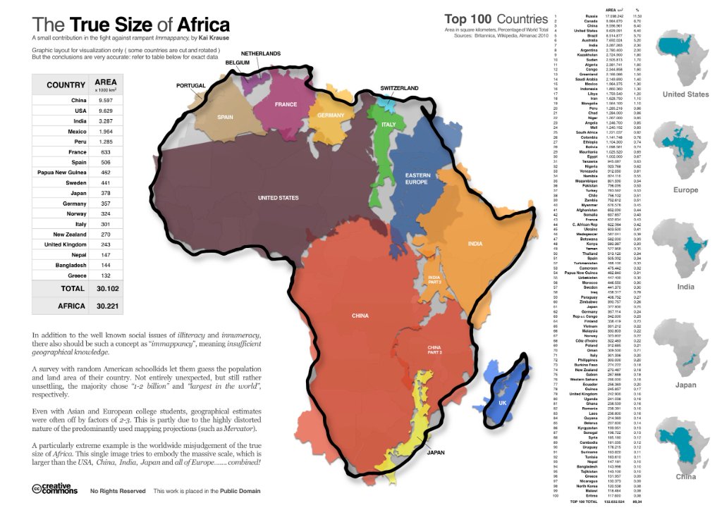
The True Size of Africa
Graphic by Kai Krause (2010) · Major nations shown at correct relative scale inside Africa's outline
Relative Land Area — Mercator (Distorted)
What fits inside Africa's 30.4 million km²?
🧭 The Mercator Was a Sailor's Tool
Gerardus Mercator designed his 1569 projection for European maritime navigation — preserving angles for compass bearings. It was never intended to show relative land size. Colonial-era schools adopted it anyway, and it became the default world map for generations.
📏 Greenland vs. Africa
On the Mercator, Greenland appears nearly the size of Africa. Greenland's true area is 2.2 million km². Africa's is 30.4 million km². Africa is 14× larger. This single distortion encapsulates how Europe's cartographic choices literally shrank the African continent.
🗺️ The Gall-Peters Correction
Arno Peters re-introduced James Gall's 1855 equal-area projection in 1973, sparking fierce debate. Critics called it "politically motivated." But the math is simple: equal area means equal area. The controversy itself reveals how deeply invested many institutions were in the old distortion.
✊ Why It Matters for This Course
When students are taught a map that makes Africa look small and peripheral, it shapes unconscious assumptions about African civilization, wealth, and power. The "True Size of Africa" is not just cartography — it is an act of cognitive decolonization.